Thursday, 22 March 2018

NHS blood campaign

1) What does BAME stand for?
BAME stands for Black And Minority Ethnic

2) Why is there a need for blood in the BAME community? 
Only 3 percent of blood donors are either black or asian and those groups are more likely to have rare blood types and suffer from sickle cell anaemia and thalassemia respectively and blood from someone of their ethnic background is more likely to work in the treatment and is less likely to be rejected by their body as it is closer to their own.

3) What does this advert want people to do once they've seen it ('call to action')?
They want young people of minority groups to donate blood to those who need it.

4) Why is the advert called 'Represent'?

Represent is an urban term that they think is used by mainly minority groups in urban areas.Arguably, this is patronising as it assumes that certain types of people all use the same colloquialisms and speak in the same way.

5) Why have the producers chosen famous BAME celebrities to feature in the advert? Give an example of three well-known people who appear in the advert and why they are famous.
Lady Leshurr, Nicola Adams, Ade Adepitan appear in this advert. Nikola Adams is a gold medalist boxer and also a well known figure in the LGBTQ+ community, Lady Leshur is a well known grime artist and Ade Adepitan is a television presenter and wheelchair basketball player. The producers used these people because they are all reletivley young people of BAME backgrounds so similar groups will relate to them and hopefully want to donate blood as those who they look up to are endorsing it.

6) Why is there a slow-paced long shot of empty chairs at the end of the advert?
This aims to create an emotional response, the slow pace ensures that the audience pays attention and the stark contrast between this and the rest of the video will shock the audience into focusing on the importance of donating blood.

7) How does the advert match the key conventions of a typical rap music video?
It has a number of different people in different parts of the city, many rap videos have a similar thing, many different shots of parts of the city so that all the young people from everywhere feel included, since rap music is often seen as the voice of the people.

8) How does the advert subvert stereotypes? Give three examples (e.g. ethnicity, masculinity, femininity, age, class, disability/ability etc.)
The advert subverts the stereotype that women are weak by showing an olympic boxer, it also subverts the stereotype that those with physical disabilities aren't active by showing a wheelchair basketball player and finally, it shows women in science to subvert the stereotype that women's occupations are either in the humanities or non-academic.

Wednesday, 21 March 2018

Always Advert Analysis

1) What key conventions of broadcast advertising can be found in this advert?

The narrative is about different people who express what they think of when they hear "like a girl".2) What text appears on screen in the advert? What effect might this have on audiences?
Many rhetorical questions appear on the screen to make the audience think about why saying "like a girl" shouldn't be seen as an insult because girls do things in the same way boys do.3) How many different people feature in the advert?
Different groups including ethnic minorities, women, men and also young girls and boys are represented in this advert.
  
4) Why did the producers decide to feature a range of different ages, genders and ethnic groups in the advert? The producers chose a wide array of people to show that this is an issue that applies to everyone and also to relate with different groups.

5) What effect does the background music have on the audience - particularly towards the end of the advert?
The music is uplifting and inspiring to show girls and women that they can do anything just as well as others regardless of their gender

6) Pause the advert at 3.08. What key conventions of advertising can you find on the screen at this point? How do these encourage the audience to make the campaign go viral?
The Call to action told people to share this advert, spread the 'like a girl' hashtag on twitter and visit their website, the brand name and logo is also clearly present to bring attention back to the company that delivered this powerful message.Audiences can share this video to their contacts and those contacts can share with others until the word is spread, also, if someone clicks the "like a girl" hashtag, it will direct them to the always twitter handle which will inform them about the campaign and link them to videos in the campaign and the always website.

7) What representation of women can be found in this campaign?
Women are represented as powerful, shown by the mise en scene of the girl in a martial arts uniform to show that girls are strong too, most of the make up worn is minimal to draw attention to the message of the campaign, rather than how people looked.

8) The #LikeAGirl campaign was hugely successful with over 65 million views on YouTube alone. Why do you think the campaign connected with audiences so successfully? 
This campaign had groups of different people so that men wouldn't click off, assuming that it had nothing to do with them rather than being a conventional advert for sanitary towels in which many males would turn it off instantly, finally, it had a good message so people would want to share it around.

Thursday, 15 March 2018

Gender representation in advertising

1) What stereotypes of women can you find in the 1950s and 1960s adverts? Give specific examples. 
Image result for retro 1950-60s adverts sexistImage result for retro 1950-60s adverts sexistImage result for 1950s adverts sexist The stereotype of women are that they are weak, emotionally and physically, they only have domestic responsibilities and they are in submission to men and should obey them.


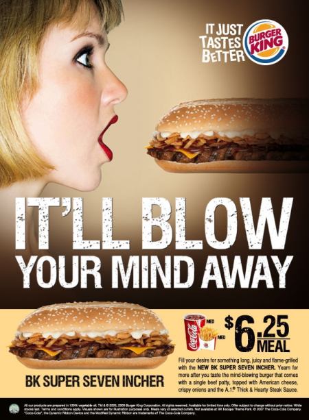
Image result for girl doritosImage result for sexist burger king ad2) What stereotypes of women can you find in the post-2000s adverts? Give specific examples. Women are seen as sexual objects and their odies are sexualised unnecessarily for things that don't require this to appeal to a largely male audience.

3) How do your findings suggest representations of gender have changed over the last 50 years? 
I think women have been treated as objects throughout history to please men however before it was for domestic responsibilities however now they are seen as purely sexual objects to appeal to men and only have their looks to offer.

Thursday, 8 March 2018

learner response

1) Based on your research, what type of people read Reveal? Consider demographics and psychographics.
C2,D and E groups read Reveal.2) Look at the lesson slides: how does the editor introduce Reveal magazine?
The editor describes Reveal as a readers best friend which shows that they are trying to be approachable and seem as though they are talking to the reader directly, hence, the use of handwriting fonts.3) What is the difference between the Reveal and Tatler target audiences?
The Tatler target audiences are A,B and C1 groups whereas Reveal readers are C2, D and E so Tatler readers have more of a disposable income and live lives similar to the lives that Reveal audiences read about.4) What issues are Reveal readers interested in?
Beauty, diet and lifestyle and celebrity updates and gossip


Media language


1) How many of the 12 magazine cover key conventions feature on this edition of Reveal?
The Headline,sell lines and price and barcode are evident as well as the main flash and cover image.2) What is the font choice used on the cover and what does this choice connote? The Reveal title font is thick and san serif with a red background to show that they are modern, approachable and informal and the red shows that there is a focus on relationships as red connotes passion.

3) How do the cover lines appeal to the Reveal target audience?
The cover lines use name checks to show that they know their audience knows who they are talking about and they are short and memorable.4) What are the connotations of the Reveal colour scheme on this particular front cover?
The connotation of the red is passion, the connotations of the pink is femeninity, the connotation of the yellow is vibrancy and energy.5) How are images used to create interest in the magazine? Find three reasons for your answer. (E.g. mise-en-scene such as props, costume and make-up, body position, facial expression).Images are reminiscient of a collage to show that Reveal is bursting with information, candid pictures with everyday props such as ice cream or a phone is used to show that celebrities are normal people.The body position is away from the camera and even though these are candid photos, all the girls are heavily made up and styled so tat they still look like celebrities.

6) What differences can you find between the use of design and typography between Tatler and Reveal? List at least three and explain the effect on audiences.
The typography in Tatler is thinner and serif but also pink to show that they are modern and feminine but also classy whereas the Reveal font is bold and san serif with a red background to show that they are modern, approachable and informal and the red shows that there is a focus on relationships as red connotes passion.This is effective as it shows that Tatler is for upper classes as the font is serif which connotes traditionalism, an upper class value whereas Reveal wants to be seen as 'friendly and approachable' to middle and lower classes.

Representations

1) What different groups of people are represented on the cover? (Look at the image and text/cover lines)
Rich people, celebrities, mainly women but some men and British people are represented on the cover of Reveal
2) What type of celebrities are represented on the front cover?
Mostly, celebrities that got their fame through reality television are featured in Reveal.

3) Are there any stereotypes being reinforced or subverted? How? Why?
The stereotype that all women are maternal has been reinforced because there are two stories featured on this cover about motherhood and pregnancy respectively. 
4) What view of celebrities does Reveal want the reader to have?
Reveal wants to audience to feel like celebrities are like them which is why candid pictures rather that pictures taken by photographers in a studio are used.

5) What would be the preferred and oppositional readings to this cover of Reveal?
A prefered reading of this cover would be that it shows people that celebrities are just like them.An oppositional reading would be that these photos have been carefully chosen to make celebrities look 'just like us' so they really aren't.
Social and cultural context

1) What aspects of British life are reflected in Reveal? How does this compare to Tatler?
The aspects of British life focused on in Reveal are motherhood, pregnancy, relationships and also health and lifestyle.2) What do the cover lines in Reveal suggest about the issues and lifestyle of Reveal readers?
The cover lines use name checks to suggest Reveal readers are very up to date with celebrity gossip to the point where they feel as though they know them on a personal level.3) Find three other front covers for Reveal. What issues or features regularly appear in Reveal? 
Relationships, celebrity updates and diets often feature in Reveal.4) Do any celebrities appear on multiple front covers ? Why are they are popular with Reveal readers?Image result for Reveal magazine covers Image result for reveal magazine Cheryl Cole coversRelated image I think Cheryl Cole appears on this magazine cover more than once because she is a very high profile celebrity that voices all of her concerns when she has issues and gets upset and struggles just like people who read this magazine so Reveal readers connect to her more than other celebrities.
WWW: Wow – there is some really impressive media analysis here. You write in real depth and detail, clearly showing understanding of the texts and insight into the target audience and media language design decisions. Keep up this good work!

EBI: The Reveal case study isn’t quite finished. I know you’ve missed a lot of lesson and homework time recently so you’re still catching up. However, these are exam CSP case studies so it’s essential you’ve completed them all. You also need to make sure you’re completing the grade 8/9 extension tasks as that’s where we should be aiming for your final grade in Media!

LR: Check the two case studies carefully and complete any missing questions or extension tasks
Tuesday, 6 March 2018

OMO

 
1) What year was the advert produced?

This OMO advert was produced in 1955.
2) How were women represented in most adverts in the 1950s?
In many 1950s adverts,women, conventionally are presented as housewives that are sensitive,and usually mothers who are happy with their duties and also accept being inferior to men in terms of intelligence and physical strength. 3) How does the heading  message ('OMO makes whites bright') and typography promote the product?

4) Analyse the mise-en-scene in the advert (CLAMPS): how is costume, make-up and placement of the model used to suggest women's role in society?
She is heavily made up with perfectly styled hair which reinforces the idea that women have to look perfect at all times.The lighting is bright and vibrant to mirror the fact that the product makes clothes whiter and brighter. her facial expression shows that she is excited about the product.

5) Why is a picture of the product added to the bottom right of the advert?
The picture of the product is there so people know what the product is so they can purchase it or recognise it in the shop and remember the advert.6) What are the connotations of the chosen colours in this advert?
The primary colours of red blue and yellow as well as white are used to show that using OMO  is simple, just like the colour scheme.7) How does the anchorage text use persuasive language to encourage the audience to buy the product? Give examples. The anchorage text uses repetition and imperatives to make their advert memorable and also to instruct people to buy the product, they also use examples of others using it and how successful it was for them.

8) What representation of women can be found in this OMO advert? Make specific reference to the advert and discuss stereotypes. The woman is doing the laundry which adds to the stereotype that women have all the domestic responsibility., her facial expression shows ectasy which indicates that she is completley happy and content to do so.

9) What is the preferred reading for this advert - what did the producers of the advert want the audience to think in 1955? The preffered reading of this is that using OMO is so simple that the woman looks care free because it is such a good product.

10) What is the oppositional reading for this advert - how might a modern audience respond to this text and the representation of women here? An oppositional reading of this text is that it reinforces negative stereotypes that only women have domestic duties.

Wednesday, 21 February 2018

Advertising Conventions


Image result for katy perry pop chips advert
1)What conventions of an advert can you find and what are the connotations of each one?
The colour scheme is composed of greens and purples, the product is visible in Katy Perry's hand,The lighting is bright, the logo is the round, serif, distinctive typography in which the brand name is written, the slogan "Think Popped!" is an imperative to try and make the consumer to see fried crisps differently.
2) For each convention, write about how this appeals to a target audience. 
The exclamation mark in the slogan shows that Popchips brands themselves as an upbeat energetic company that's like a friend telling you to buy healthier crisps because they care about you.The use of a celebrity with a majority female fan base, the traditionally feminine colour of purple and the mention of diets show that the target audience is female. The pun used in the title and the serif font shows that they are appealing to a relatively young target audience.
3) What is the USP (unique selling point) of the product and how do you know?
The USP of Popchips is that they are cooked differently than traditional crisps, they are popped rather than fried, baked or kettle style.

Extension: Look for another, different advert for the same brand. What similarities can you find? What differences are there? Can you find a consistent brand identity across both adverts? Post the second advert to your blog and write a paragraph of analysis answering these questions.

Tuesday, 6 February 2018

Reveal Study Case

Media language


1) Based on your research, what type of people read Reveal? Consider demographics and psychographics.
C2,D and E groups read reveal.They tend to be female and from the ages of around 18-34.2) Look at the lesson slides: how does the editor introduce Reveal magazine?
The editor introduces the magazine as a "girl's best friend" who talks "with you not at you", this shows that reveal is trying to be friendly and relatable to the every day audience.

3) What is the difference between the Reveal and Tatler target audiences? Tatler aims to reach younger, wealthy audiences are upper class it is targeted to be read by A and B groups whereas Reveal aims to be read by C1 and 2s, D and E groups who are female and younger from 18-34.

4) What issues are Reveal readers interested in?
reveal are interested in beauty, fashion, diets and celebrity gossip.

1) How many of the 12 magazine cover key conventions feature on this edition of Reveal?
The price is very prominent on the front of the magazine, it has a bright background to draw attention to how cheap it is.It has a central image which is a paparazzi shot of Katie Price and Peter Andre.The tag/sell lines talk about the main stories that are based on relationships, beauty and general celebrity gossip.The main flash links to the central image and is about Katie and Pete's relationship.The colour scheme is quite wide from bright pinks and yellows to more subtle turquoises and small hints of red to highlight themes passion, sex and relationships.There is colloquial and informal language to make the audience relate. The font choices are mainly san serif to make the magazine seem approachable with the exception of the price and the small examples of handwriting fonts to make the audience feel as though they are connecting with the celebrities and producers of the magazine.


2) What is the font choice used on the cover and what does this choice connote? 
A round san serif font is used to make the magazine seem friendly, approachable and modern.   

3) How do the cover lines appeal to the Reveal target audience?
The cover lines appeal to audiences that are interested in celebrities by resembling a collage pattern to show that the magazine is almost bursting with information about current celebrities.

5) How are images used to create interest in the magazine? Find three reasons for your answer. (E.g. mise-en-scene such as props, costume and make-up, body position, facial expression). The colour scheme is wide, with bright pinks, reds and yellows and slightly deeper turquoises to show that the magazine is vibrant and youthful.The mise en scene shows a celebrity devouring an ice cream cone to humanise celebrities and show that they are just like us.

6) What differences can you find between the use of design and typography between Tatler and Reveal? List at least three and explain the effect on audiences. The typography in Tatler for the cover image is narrow and serif to communicate to the audience that Tatler is  sophisticated however, a bright pink is used to highlight the fact that they are modern and feminine. for reveal, it is a round, san serif, white font with a red background to show to the audience that reveal is modern, approachable and focuses on relationships as red has connotations of love and passion.Tatler has a more minimalist design with one image, a clear main flash and cover lines that are evenly spaced out to show that Tatler is classy it makes the magazine look expensive and the few cover lines they have are well thought out and of a high quality. The cover image for Reveal has a lot less space and there are plenty of smaller photos and cover lines to make it almost seem like a personalised scrap book and also it seems as though they have many interesting stories for a resonnable price of 99 pence that is clearly displayed even before the title.

 1) Based on your research, what type of people read Reveal? Consider demographics and psychographics.
i think that mainstreamers and strugglers are the most common type of people that read Reveal because it is affordable, approachable and advertises things that are affordable and also often gives free gifts that some strugglers would find hard to buy at full price. I think that majority C2, D and E groups read Reveal due to its marketing and I also believe the majority of people who read it are female, young and white because most copies of Reveal are sold up north where it is less diverse and it the lower classes are in larger numbers.

2) Look at the lesson slides: how does the editor introduce Reveal magazine?

3) What is the difference between the Reveal and Tatler target audiences?

4) What issues are Reveal readers interested in?